SIMPLIFIED

MedMatch is a Medical startup in Chicago with the mission of connecting medical professionals with hospitals looking to hire. They hope to lessen the confusion of job-searching and candidate vetting in the medical space by handling the process from initial connection to the inital interview.
Our team was tasked with helping MedMatch analyze the usability and aesthetics of their interface, make improvements to core areas, and deliver a set of visual and interactive guidelines for their team to implement site-wide as they prepare to launch their product.


We set out to understand what in the current interface needed improvement. We conducted a usability heuristics evaluation of the site and analyzed the visual aesthetics for other similar services that target users might be familiar with.


Dated use of ornate typography, muted colors, and inconsistent styling
Unclear and incosistent organization of information
Neutral, Monochromatic Visuals
Lack of strong Brand style beyond color and type treatment
Clear Call to Actions using bold colors
Visually cluttered with large volume of text
One primary color that defines the brand
Soft, neutral gradient with clean imagery

As we learned more about MedMatch’s current interface as well as those of their competitors, we decided to focus our efforts on a few critical areas that affect users most and position MedMatch’s brand most competitively.
Profile Onboarding - key to job suggestions
User Profile - key to how users market themselves
Match management - key to user engagement
Develop consistent interactions across site
Organize information into clearer hierarchies
Beginner users can know what the mastery bar is
Build and reinforce brand values in visual design
Create a style guide to keep design consistent
Create a style that works across a multi-portal site

After reviewing the needs of the current interface, we set to work exploring three distinct visual and interactive prototypes for key features.

Tinted grey backgrounds, geometric textures, and complex gradients invoke a young, techie mood


Neutral backgrounds, smooth shapes, and pops of color invoke a trustworthy, relatable mood


Bold colors, simple shapes, geometic iconography, and serif typefaces invoke a safe, energetic mood


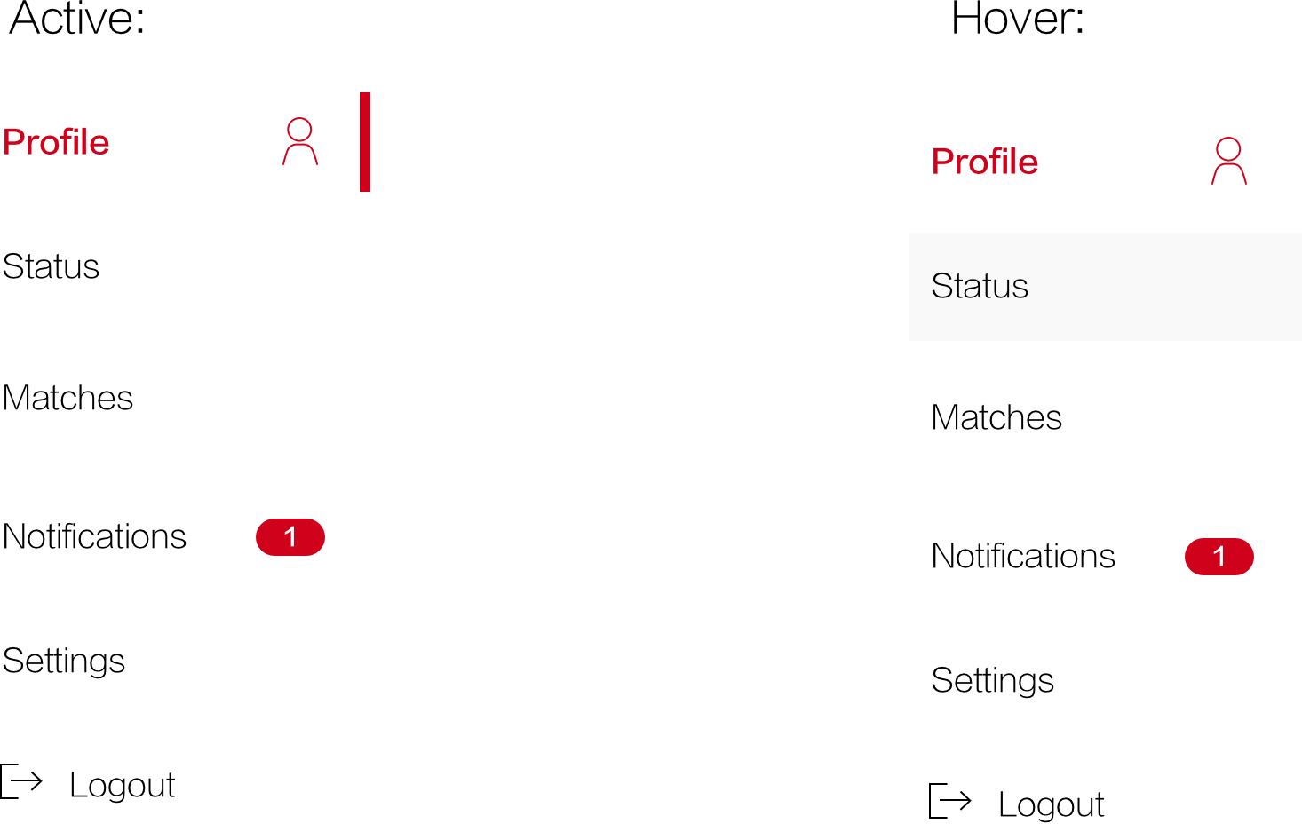
A side navigation menu helps user navigate a large number of items on narrow screen sizes.

A card-based interface helps users search for, review, and take action on many items at the same time.

Modals help users adjust settings and get on-boarded without loosing their sense of place within the site.

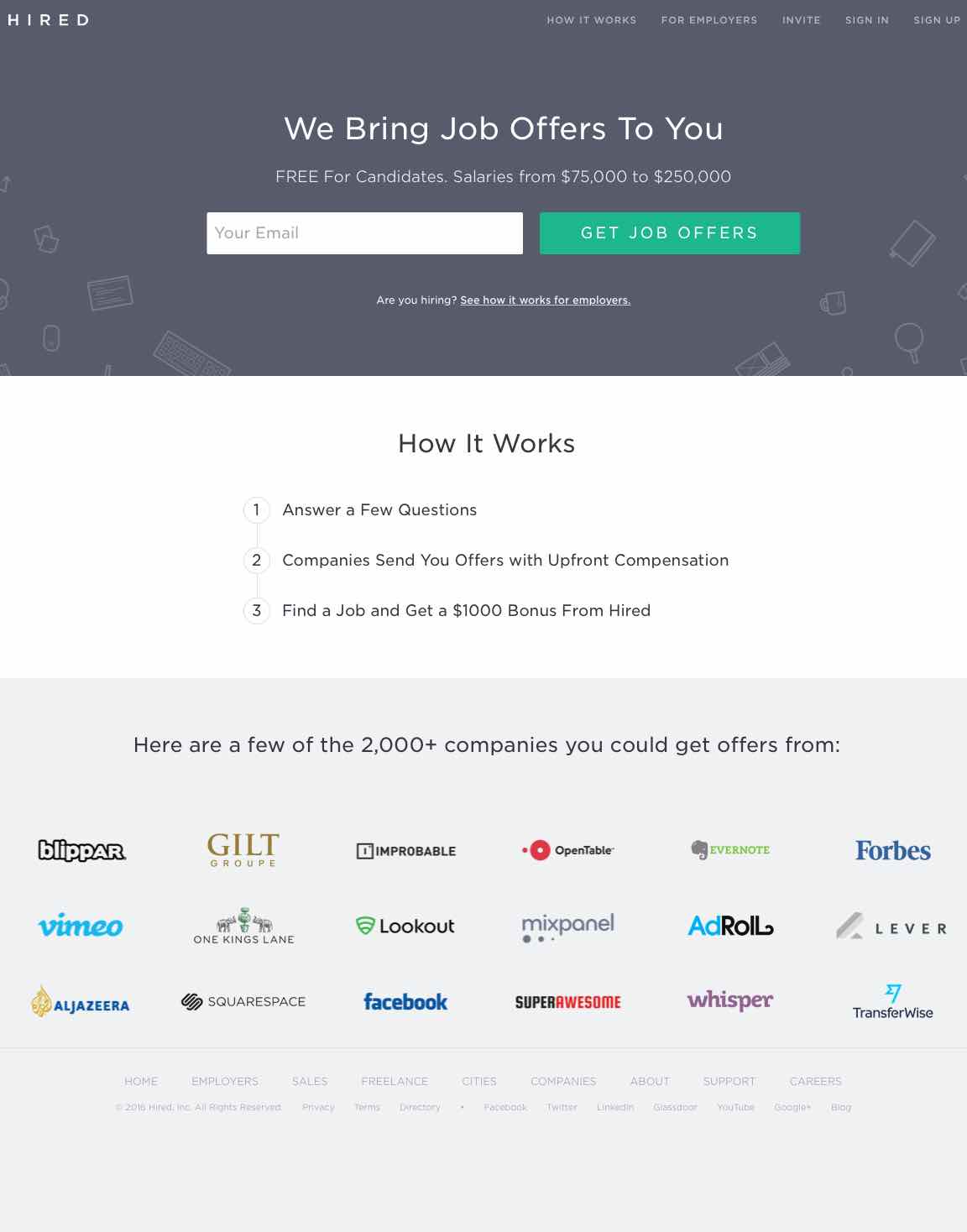
After touching base with the team at MedMatch, we decided the aesthetic that would best serve their brand in its current state is the modern look. We built out a fully-fledged style guide emphasizing cleanliness, trustworthiness, and professionality, and created multiple iteraitons of high-fidelity mockups for our features in focus.


The primary context in which users do the information-dense task of job searching is on the desktop. So we started with that as the primary medium for our design.


As users progress in the match process, they want to have constant access to their match statuses. So, adapting the design for mobile devices was critical.


After working with the Medmatch team to refine the design to match both user and business goals, we handed off our assets to their development team to implement.

The design is ready for implementation across both the Job Seeker and Recruiter portals. We also wanted help MedMatch think through next steps to help the product be successful.


